Prerequisites
- Understanding of Block types
- Completed Quickstart
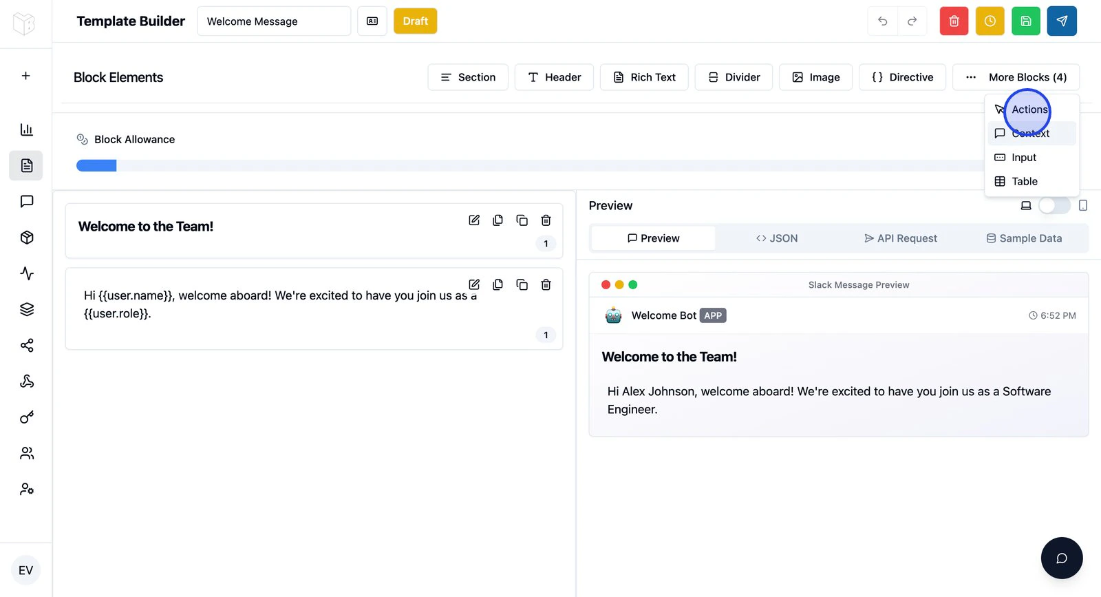
Add an Actions block
- In the Template Builder, find Actions in the Block Toolbox
- Click to add an Actions block
- Configure the default button (or add more — up to 5 per block)
Button configuration
Each button needs: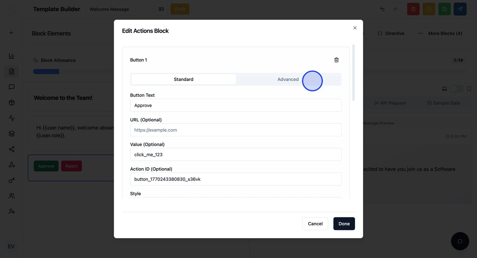
Example: Approval workflow
Button 1 — Approve:- Label:
✓ Approve - Action ID:
approve_request - Style: Primary
- Value:
{{request.id}}
- Label:
✗ Reject - Action ID:
reject_request - Style: Danger
- Value:
{{request.id}}
What happens when a button is clicked
You can configure each button to:- Send a webhook — HTTP request to your API (see Button webhooks)
- Update the message — Replace or append content (see Message updates)
- Open a modal — Collect more input (see Modals)
Next steps
Button webhooks
Send HTTP requests when buttons are clicked.
Message updates
Update the message after a click.
Modals
Open forms from buttons.